1.2.1: Layout
Learning Objectives
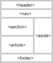
CSS layout is about organising HTML elements into nested boxes and determining their positions
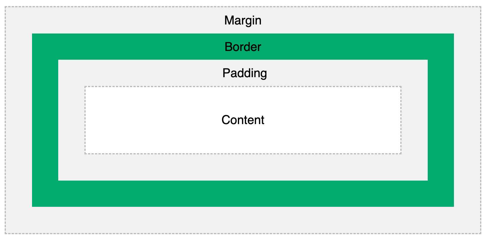
CSS box model determines the size of each element on screen
CSS
displayproperty controls the manner in which elements appear on screen, e.g. in horizontal or vertical orderCSS
positionproperty allows us to position elements outside of the normal document flow, e.g. a fixed navbar or chat windowFlexbox allows simple and robust layout of collections of HTML elements
Introduction

When determining how to layout elements with CSS, first organise elements into nested boxes, then determine which CSS styles need to apply to which boxes. By default browsers will render all HTML elements in a single vertical column.
CSS Box Model

The CSS box model controls how much space an element takes on screen with CSS properties such as content width, content height, margin (area outside border), border (area surrounding content) and padding (area inside border but outside content). While helpful for controlling exact size of HTML elements, we recommend using flexbox properties (covered in later submodule) to layout HTML elements for a more robust layout.
3 common ways to specify box dimensions
1) Pixel count
Only works for block display elements. Generally less recommended because difficult to create responsive (mobile and desktop-friendly) layouts with fixed pixel sizes.
2) Percent of parent container
Percentage is relative to the parent container, allows responsive sizing. Percentage height does not work unless parent has fixed size.
3) Percent of viewport (window)
Viewport sizing allows for most responsive sizing based on screen size, but needs to be coordinated with other elements on screen since sizing is not relative to other elements.
W3Schools documents all ways to specify box size.
Debugging CSS boxes
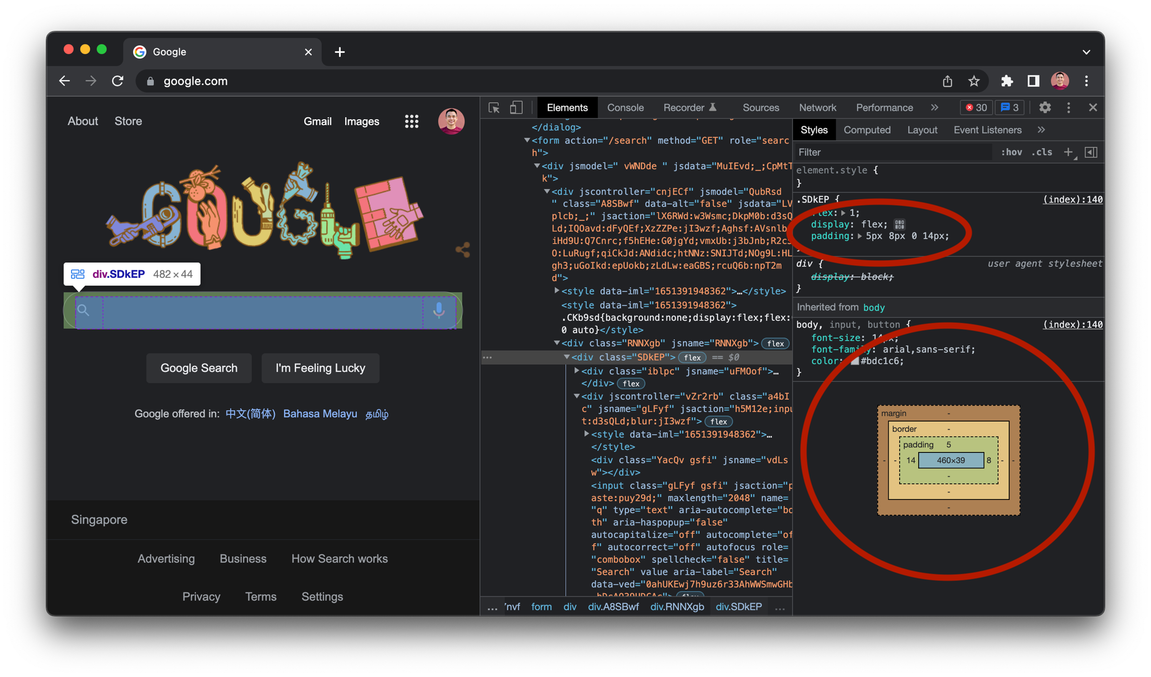
Chrome helps us visualise CSS box properties of every element on every page at the bottom of the Styles window in the Elements tab in Chrome DevTools. To see box properties of any HTML element, right click the element and click "Inspect". Box properties in the box visualisation should match the most-specific box properties at the top of the CSS styles list (ordered in decreasing specificity).

Apply box-sizing CSS property to include padding and border in box size
CSS does not include padding and border in box size by default. In the following example, CSS produces a box 300px wide (including 50px of padding on both sides), even though we specify width of 200px.
To make width and height include padding and border space, apply the box-sizing CSS property to all elements.
CSS display Property
display PropertyThe CSS display property controls the way target elements render on screen. The 2 most basic display values are block (full screen width) and inline (width of element only). By default, every HTML element has either block or inline layout.
inline-block is a 3rd display property that enables inline elements with block properties such as spacing on all sides. inline elements cannot have custom spacing around them.

Centring elements on screen
The margin property's auto value allows us to automatically set left and right margins to centre an element on screen. inline elements cannot be centred because inline elements cannot have margin settings.
Constraining element width
We may also want to constraint element width to prevent content from becoming hard to read across the full width of a horizontal screen. We will look at fixed, percent and max width layout to do this. Width settings do not apply to inline elements.
Fixed-Width Layout
Fixed-width layout fixes the width of the target element, regardless of how small or large the screen size is. This works for large screen sizes but may look poor on small screen sizes.
Percent-Width Layout
Percent-width layout fixes width to be a percentage of screen width. This makes our content responsive but may not be what we want, especially if we want layout to be different across mobile and desktop.
Max-Width Layout
Max-width layout allows our element to occupy 100% of screen width at smaller screen sizes but only a specified width at larger screen sizes. This helps when we wish to maximise screen real estate on mobile devices but not make content too wide on desktop devices.
CSS position Property
position PropertyThe CSS position property allows us to position HTML elements outside the normal "flow" of an HTML document. We can use position: fixed to fix a navbar to the top of a screen even when we scroll down; We can use position: absolute to position a counter at the top right corner of a notification icon.
Position Offset Properties
Position offset properties top, right, bottom, left set the relevant offset from the element's position. We can use any CSS unit to express offset.
position Property Values
position Property ValuesThere are 5 position property values: static, relative, fixed, absolute and sticky. static is the default property for all elements with no explicit position value. relative is relative to where the element would have otherwise been. fixed is a fixed position on screen regardless of where the user scrolls. absolute is relative to the closest explicitly-positioned ancestor element. sticky is a combination of relative and fixed. Read more about each value and how to use them at W3Schools.
z-index
When playing with position values its possible we will have elements in front of and behind each other on screen. By default the overlapping element mentioned last in the HTML document will be in front. To alter elements' relative forward and backward positions on screen, use the CSS z-index property.
Flexbox
Flexbox allows simple and robust layout of collections of HTML elements. Without specifying specific distances or percentages, flexbox allows us to position elements in vertical or horizontal order, at the start, middle or end of their container, grouped together or spaced evenly apart, with or without specific ratios between elements.
To use flexbox we need to set "flex properties" on both containers of the elements we wish to position and and the elements themselves. The containers are known as "flex containers" and the elements they contain are known as "flex items".
There are some common flex patterns that we should become aware of as developers as well as some key flex properties that should be explored before to applying flex onto our websites. Generally the properties flex, flexDirection, alignItems and justifyContent are utilised to achieve the desired layout.
Say we had this CSS classes and code block:
The resulting output on the screen would look something like this:

Lets add a flex property on the div containing all of the circle elements.
By adding the class flexContainer to the parent element and applying the display: flex; property, we take each "flex item" and alter how they are rendered onto the screen. In this case we stop them from appearing as block level elements and make them appear as in-line elements. The elements now appear like this:

The next flex property that we will explore is flexDirection, this specifies to the direction the container should stack the "flex items", as a column or row, you can even alter the order of the "flex items" with the row-reverse or column-reverse value. Below we alter the last element in the container to appear as a sqaure, but we will alter the elements order and make it a column again.

Altering the order and changing the direction though important isn't really what developers use flex for. Flex allows developers to state how they want information rendered, depending on the size of the screen, the number of items and size of the items flex will dynamically sort out each element to render it on screen. In the next example we will explore flex-wrap which can wrap the "flex-items" if they overflow out of their current container. Below is the code were we apply flex-wrap and add in additional elements. When applying this property you can use wrap, no-wrap and wrap-reverse.

It is actually possible to combine the flex-direction and flex-wrap properties, to do this use the flex-flow property and apply both values within. This will be shown in the next example.
At this stage its possible to see the awesome power of flex and how it can be used within Software Engineering to create dynamic and re-sizeable user interfaces. Lets talk about another flex property that will be extremely helpful. justify-content, this property is used to align the "flex items" horizontally within the "flex container".

As you can see the "flex elements" have been centered within the container, and wrap when there isn't enough space for the overflow elements. You can use this property with a few values, not just 'center'.
justify-content values
flex-start
Default value. Items are positioned at the beginning of the container
flex-end
Items are positioned at the end of the container
center
Items are positioned in the center of the container
space-between
Items will have space between them
space-around
Items will have space before, between, and after them
space-evenly
Items will have equal space around them
To get truly centered content, we need to align the items to the center vertically as well as horizontally. To do this we can use the align-items property, just be aware that you need to specify a height to the "flex-container", or this may not work correctly. This property will align the content vertically to the container.
You should note that you can apply other values than center, similar to justify-content.
normal
Default. Behaves like 'stretch' for flexbox and grid items, or 'start' for grid items with a defined block size.
stretch
Items are stretched to fit the container
center
Items are positioned at the center of the container
flex-start
Items are positioned at the beginning of the container
flex-end
Items are positioned at the end of the container
baseline
Items are positioned at the baseline of the container
As you can see from the image below the "flex-items" are centered horizontally and vertically within the image. This is a common pattern that is used when applying flex onto websites.

To truly become great at flex, please go through the exercises below, this will help you greatly when considering your user interfaces, which is what you users will ultimately see.
Exercises
Watch Flexbox in 100 Seconds video to know what flexbox is
Complete Flexbox Froggy game to practise flexbox
Complete W3Schools flexbox tutorial to read about and play with basic flexbox
Review CSS Tricks flexbox cheatsheet on all flex container and flex item CSS properties
(Optional) Complete Flexbox Defense game to practise flexbox
Last updated